Graphic Design Intro 1: Design Fundamentals
Table of Contents
 You don’t need a graphic design degree to create stunning graphics. You just need to understand some basic fundamentals of graphic design. This is what we will look at in this article.
There are four fundamentals of design:
- Color theory
- Imagery
- Typography
- Composition
4 Fundamentals of Graphic Design You Need to Know
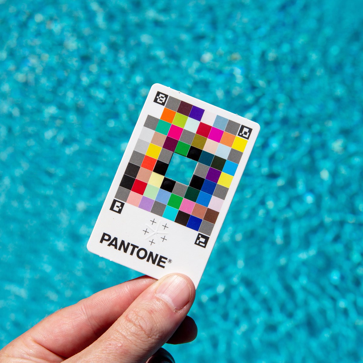
Color Theory
Color is a fundamental element to make your projects the right way. It is used for attracting attention, conveying meaning and, of course, for aesthetics. We usually don’t even think about the colors we look at; We judge things quickly and often instantly measure whether something is desirable, professional, pleasant, ugly or even weird based on its color.
The most important thing to think about when using colors is the contrast between them. Contrast refers to how much one color differs from another.
For Instance, you can use contrasting colors within an image to make text stand out from the background. Complementary colors, such as yellow and purple, or blue and orange, provide the maximum contrast between them.
Let’s talk about the most common colors, brands used and the meaning or sentiment they can invoke from your audience.
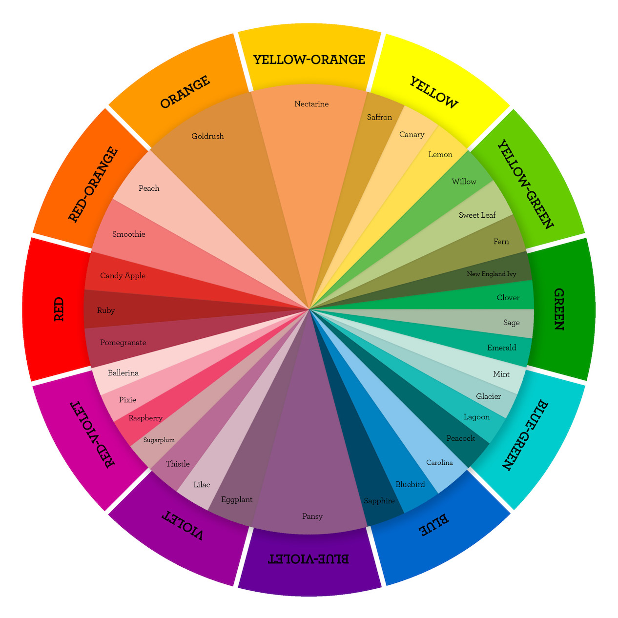 Red, can trigger strong emotions, both positive and negative, to create a sense of urgency, making it effective with sales. It also stimulates the appetite, which is why it is commonly used in the fast food industry.
Orange, another warm color, is considered light and fun, so it suits less “corporate” brands. Darker shades of orange are associated with autumn, which lends itself to more “earthy” signs brand.
Green, is pleasing to the eye and synonymous with health. Therefore, it will often be seen by brands promoting health products, such as pharmaceuticals or food brands. It can also be linked to growth or power, as is the case with financial or military organizations.
Blue, on the other hand, has a calming effect on the mind and is the color of reason, but also of strength, wisdom and trust, which is why it is used so widely. It’s a safe choice for brands, but brands need to consider whether it will help them stand out in their space.
Pink, has historically been used to portray femininity, as with Barbie and Cosmopolitan magazine. But today, many mainstream brands use it independently of their audience, such as Lyft. It represents youth, but it also inspires comfort and represents hope. Pink has been used successfully in many industries to “break the mold”.
Black is synonymous with luxury and power. Although paired with a small amount of a bright color, it can add energy to the sophistication. Black fits well in some industries like fashion, for example, but maybe not in others, like health care.
White and Silver represent cleanliness and have often been used for a modern look and feel. However, it should be used with care as it may lack personality. Many brands use white to complement a more dominant color. When done right, adding white to your design offers a modern, simplistic, and clean look.
Imagery
We have seen that images lend themselves well to digital media, but there are some general points to consider. First of all, audiences respond well to images with the people in them. It helps create an emotional connection as campaigns are aimed at real people and your images should reflect that.
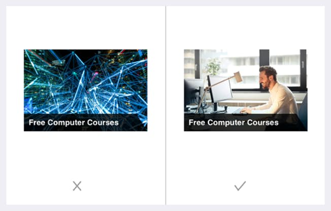 Image quality is also very important. When customers are considering an online purchase, they want to be able to browse images that provide a high level of product detail.
People often leave an e-commerce site because the product image isn’t of a high enough quality to help them make a decision. It negatively affects your impression of the product and you may lose the sale.
Next, remember that most web traffic comes from a mobile device, so it’s very important to test your graphics on mobile devices to make sure it still looks good in a smaller size. If not, consider creating a separate version of your artwork specifically to show people using mobile devices.
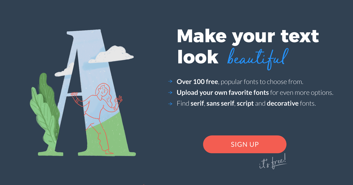
Typography
What about the typeface or fonts you use?
It is important when choosing a font for your image, not to try to do something completely different. Readers expect to see familiar fonts, such as system fonts, e.g. Arial, Helvetica, Roboto.

Use up to two or three font families on a single web page and fewer for your ads and images. See the image below. How many characters can you count on it?
What is a font family? A font family simply means a grouping of fonts defined by commonly shared design styles. For example, Roboto is a family with bold, italic, or subtle styles.
You will also find “Serif” and “Sans-serif” fonts. A “serif” is a small decorative line that is added to a font. The most common serif font is Times Roman. A common sans serif font, or “sans serif”, is Helvetica. Serif fonts are used to improve the readability of text in things like blogs, articles, or newspapers.
Try not to use more than 10 words on each line. For titles, consider using a heavy sans-serif font with a larger size. Make sure that the right emphasis, or size and “weight”, is applied to the text based on its priority.
If you need to add text, for example for an image from a social network or an image from a blog, make sure the color contrast is sufficient
 Remember: it’s the combination of an image plus your message and the way it’s worded, and also the fonts you use, that can make the difference between success and failure in reaching your audience.
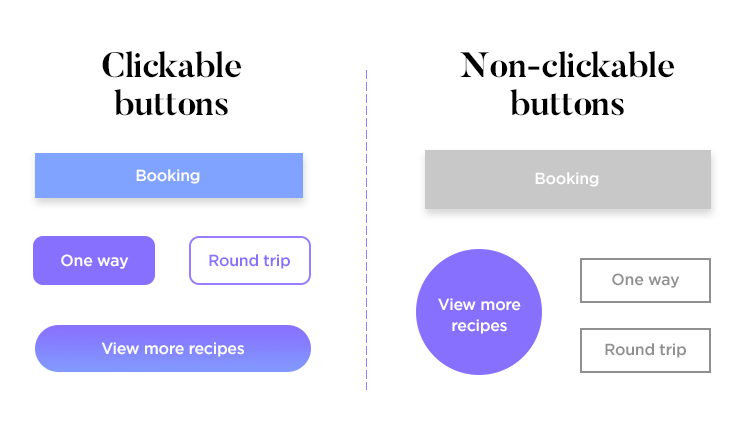
Composition
Once you know the colors, images and fonts of your image, you need to put them together in the best possible way, and this is where composition comes into play. Your goal should be to make the design as simple and elegant as possible. Eliminating clutter and visual noise help the user focus on one task at a time.
After removing all unnecessary information, you need to make sure that the content is, all images, buttons, colors, shapes, and text – are organized in a clear and logical way.
 Each piece of graphic design, content should have a purpose. When creating a design, ask yourself, “What is its purpose?” Do I have to convince the user to do something? Inform them?
Push them to keep reading? Fill out a document? Or is it just there to give you information? Even if you have multiple goals in mind for your content, pick one and make sure your design makes it very clear to the end user what the goal is.
There are two key ways to simplify your design. First of all, make sure you use blanks; and secondly, remove anything that is not absolutely necessary. Whitespaces help focus attention on what you want the user to see.
It helps the user not to be overwhelmed by what they are looking at. Every element within your design must have a purpose. Unnecessary information can make your project complicated and annoying.
Remember: focus on getting the key things right – color, images, typography and layout – and your designs will hit the mark with your audience.
Want to learn how to create a brand style guide? See the next article in the series. Stay connected to Urban Arts.